

Have you ever wondered how companies like Google or Airbnb manage to maintain a consistent and appealing user interface across all their digital platforms? The secret lies in a powerful documentation mechanism called a design system.
Today, we're going to walk you through the process of creating your own design system. We'll make it simple, interactive, and give you real-world examples so you can see the principles in action. Let's get started!
What is a Design System?
Before we dive into the how, let's explore the what. A design system is a comprehensive, documented set of components, patterns, and principles used to create a product's user interface (UI). It's like a cookbook for your brand’s digital presence, providing a recipe for consistent design.
Consider Google's Material Design. It's a design system that provides guidelines for the look, feel, and interaction patterns across Google's vast array of products. From Google Maps to Gmail, the user interface maintains a consistent and cohesive design language, all thanks to Material Design.

The Building Blocks of a Design System
Creating a design system is like putting together a well-planned jigsaw puzzle. It comprises four critical pieces:
-
Design Tokens: The atomic level of a design system includes the colors, fonts, spaces and icons. These atomic design particles are the base of any design system and they resonate with the identity of your product and organisation.
-
Components: Next, we have the building blocks created from design tokens. These reusable interface elements, such as buttons, cards, and navigation bars, form the core of your design. Airbnb's 'Book Now' button, crafted using their unique color palette and typography, is an excellent example of a component.
-
Patterns: A level up, we have patterns. These are standard solutions to recurring design challenges. They provide a sense of familiarity to users, enhancing usability and efficiency. Airbnb's search bar, which combines their 'Book Now' button, input fields, and icons, forms a pattern that's used extensively across their website.
-
Guidelines: Last but not least, we have guidelines. These are the rules and principles that explain how to use the design tokens, components, and patterns. Airbnb's Design Language System (DLS) is a comprehensive guide that helps their designers and developers align with the brand's design ethos and maintain consistency.
Building the Design Tokens
Creating your design tokens is like laying the foundation of a building. You need to choose colors that resonate with your brand's ethos.
Let's consider Airbnb, whose unique color palette, featuring hues like Rausch, Babu, and Arches, becomes part of their design DNA.

Typography, another essential design token, should align with your brand's voice. A brand that's fun and friendly might go for a rounded, cheerful font, while a formal, corporate brand might choose a sleek, sharp typeface.
The third primary design token is spacing. This includes the margins, padding, and overall layout of your design elements. This might seem trivial, but effective use of space can drastically enhance the usability and aesthetic appeal of your designs.
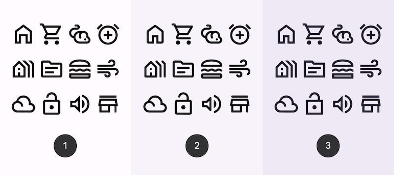
Last but not least, icons. They’re small yet potent elements carrying enormous visual load. Your iconography can play a significant role in defining your design language and identity.
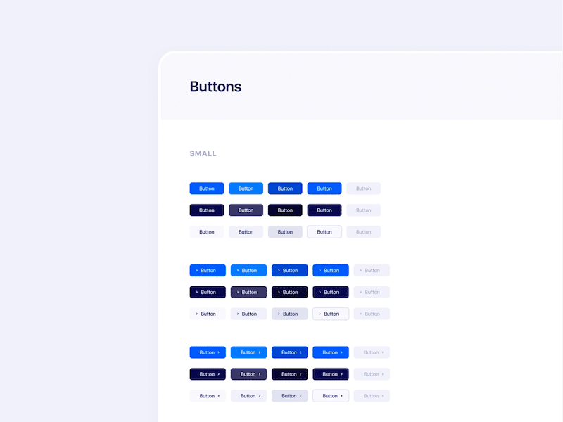
Crafting the Components
With the foundation in place, you're now ready to start building. The first structure to go up is the components. These are reusable interface elements made from your design tokens.
Imagining designing for a calm and tranquil brand, we can create a button family using soothing blue for the background and a friendly, rounded font for the button's text. Once created, this button can be used throughout your interface, ensuring consistency and saving time.
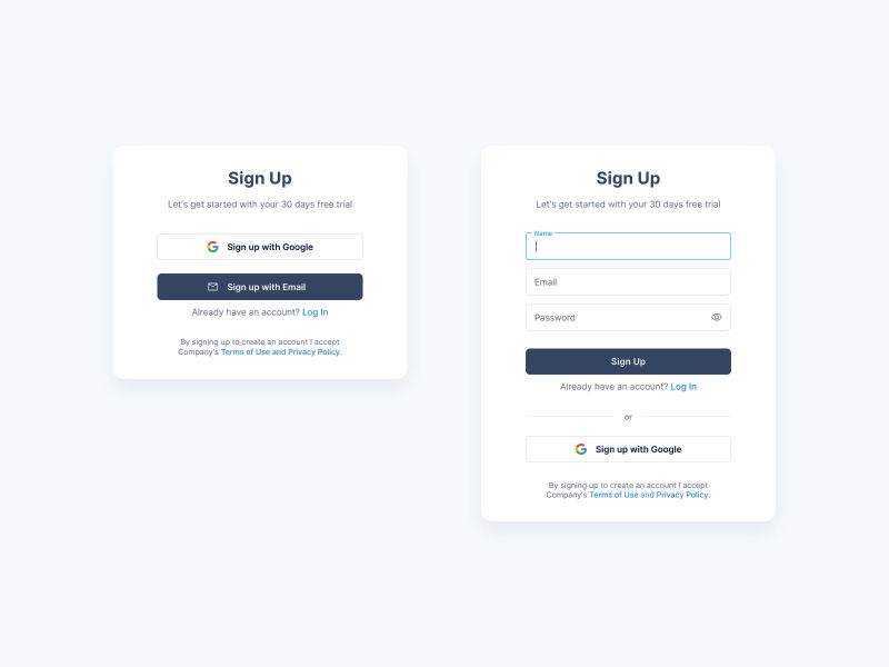
Establishing the Patterns
Once you have your components, it's time to start assembling them into patterns. Patterns are like model rooms in a furniture showroom. They show how various pieces (components) can come together to solve common design problems.
A widely common need is a contact form. We can create a pattern combining a "Sign Up" button with input fields (where users can enter their name and email) and labels (to guide the user). Once this pattern is established, it can be reused wherever we need a contact form, ensuring a consistent user experience.
Writing the Guidelines
With all your design tokens, components, and patterns ready, it's now time to document your design system. This is the instruction manual for your design team. It explains when, where, and how to use each element to maintain consistency across all platforms and applications.
Google's Material Design System is a perfect example of well-documented guidelines. It provides a clear and detailed explanation of how to use each design element, promoting consistency and making the design process more efficient.
Maintaining the System
A design system isn't a set-it-and-forget-it kind of project. It's more akin to a living organism. It needs to adapt and evolve as your brand grows and changes. Regular audits, updates, and revisions are essential to keep the system current and effective.
The key here is to ensure the design system remains a helpful tool, not a hindrance. It should serve as a guide, not a straightjacket. If designers find the system is limiting their creativity or making their work more difficult, it may be time to revisit and revise the system.
Remember, a design system is not an end in itself. It's a means to an end - the end being a consistent, appealing, and effective user interface across all your digital platforms.
Creating a design system may seem like a daunting task, but by breaking it down into these manageable steps, you can systematically construct a unique, robust, and practical design system that will serve your brand well for years to come.