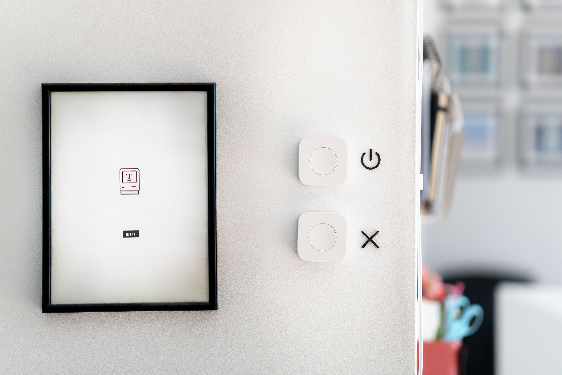
Let’s start with a quick 2 minute activity to get you warmed up!.
Detach yourself from your current environment for the next 60 seconds..
Ready?
Picture yourself in a room where every object and function responds to your mere thoughts and subtle gestures. No visible buttons, no touchscreens. Desire a cooler room temperature? Simply think it. Feel like dimming the lights for a cozy ambiance? Just visualize it.
Now, with your impressions fresh, slowly come back. Jot down or mentally note your feelings and what you imagined.
Were you surprised by how naturally you expected things to happen without any tangible intervention?
This isn’t just a figment of the imagination. It’s a snapshot of the future of digital product design.
The Magic of Invisible UI Design
The exercise you just did is not far from the reality that digital product design is inching towards. The future might see interfaces becoming nearly, if not entirely, invisible. This mesmerizing concept is termed "Invisible UI" or "Zero UI". Let’s explore this realm of design.
 Invisible UI is like the room you just imagined - where everything happens effortlessly.
What is Invisible UI?
Invisible UI focuses on crafting intuitive, seamless user experiences where the user breezes through, feeling almost as if there’s no interface at all.
The prime goal? Reduce cognitive load and foster as natural an interaction with digital products as feasible. Voice assistants epitomize Invisible UI. No screen, pure conversation.
You've possibly encountered facets of Invisible UI already. Reflect on voice-activated smart speakers, gesture-regulated smart TVs, or AI-driven recommendation engines. In each scenario, the tech feels less like an external tool and more like an intuitive extension of your psyche.
The real magic of Invisible UI is that it feels organic, natural. Users are not hindered by complex menu structures or confusing navigation paths. Instead, the technology anticipates their needs and responses accordingly, fading into the background and allowing the user's intentions to take the forefront.
You’ve probably been hanging out with Invisible UI without even knowing it:
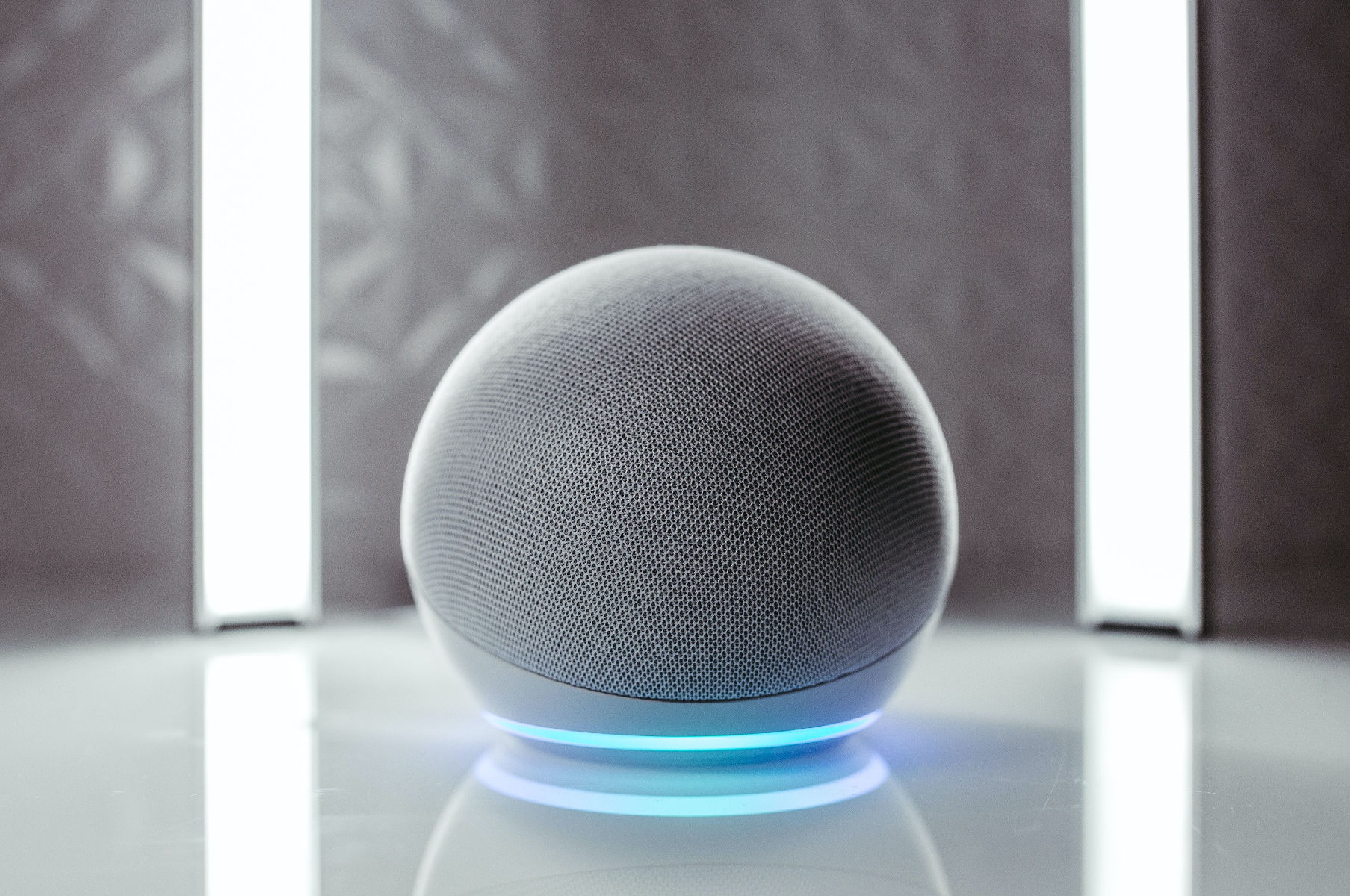
Smart Speakers: Ever just shout out to Alexa, Siri, or Google to play that catchy tune or tell a lame joke? No screens, just voice.
Gesture-Controlled Cars: Some cool cars nowadays let you flick your fingers to change music or answer calls. Yep, you’re like a Jedi.
And the newest, most advanced example of Invisible UI
Apple Vision Pro: It has changed your computing interactions from physical to spacial, blending digital content into your physical space. You navigate simply by using your hand, eyes and voice.
The Invisible UI Design Process
Designing an Invisible UI requires a deep understanding of human psychology, user behavior, and empathy. More than ever, designers have to think like their users, predicting their needs and preferences to deliver an intuitive experience.
It's less about aesthetics and more about understanding, less about visibility and more about feeling.Key considerations of the design process include:
Understanding User Context: The design should take into account the user's environment, their physical and emotional state, their goals and intentions. Where they are, how they're feeling, and what they might be craving. It may actually seem creepy to a certain degree.
Anticipating User Needs: The system should be able to predict what the user wants to do next, based on their past interactions and behavior patterns. Tech that gets you, it predicts what you might need next.
Seamless Integration: The interface should be so seamlessly integrated into the user's daily life that it feels like second nature to them. It should feel as familiar as grabbing your favorite snack from the fridge.
As we gear up for a more digitalized future, Invisible UI offers a raw canvas for designers to move beyond screen limitations and create more organic experiences.
As illusionist Teller eloquently phrased, "Sometimes, magic is just someone spending more time on something than anyone else might reasonably expect." The same resonates with top-tier design.
Perhaps, the next game-changing Invisible UI masterpiece will emerge from your imagination.

